Contributors to this chapter: Jonas Heiberg & Johan Miörner
Visone is a powerful, yet simple software designed for visualizing (social) networks. In fact, it has been designed to make network visualization more accessible to social scientists (Baur, 2008). In this part of the guide, we will give a first introduction on how to visualize your networks. Visone offers plenty of additional features, which will not be covered by this guide, and there are also several other network visualization softwares available with similar functionality.
Visone uses terminology from the field of social network analysis. Networks are made up of nodes that represent actors or concepts in STCA, and edges/links that represent the connections between different nodes (see also the note on terminology). In this chapter, we will adopt this terminology when discussing the different steps and functions of network analysis in Visone.
Prerequisites: Installation of Java and download the Visone executable.
Importing networks and basic features
When visualizing networks in Visone, you will need to first have exported the two-mode network from NVivo (Chapter 4) and, if you want to make one-mode projections, have transformed it into one-mode networks using R (Chapter 5). This guide presupposes that you have the corresponding CSV-files ready before proceeding to the next steps.
For the sake of illustration, the following sections will exemplify how to visualize a one-mode network using either a centrality- (radial) or a stress minimization layout. There are other layouts that might be suitable for your particular needs and research design, which are not covered by this guide. Furthermore, we will also briefly discuss particular considerations when visualizing two-mode networks. This may be relevant to present your results, but also as a way to get an idea of your data during the coding process.
Finally, the last section will illustrate how to use data from attribute lists (see Chapter 4) to give nodes and links features such as size and colour. This process does not differ between one- and two-mode networks.
To explore additional features in Visone, have a look at the Visone Wiki.
Importing CSV-files to Visone
As a first step, you will have to open the CSV-file representing your one- or two-mode network. Click Open – select the CSV-file you want to visualize – click CSV files (.txt .csv).
In the dialogue box that appears, a reasonable first action is to click try detection in the top right corner. This will make Visone attempt to identify the properties of the network in the chosen CSV-file and adapt the settings accordingly. However, it is recommended that you spend some time going through the options.
- Data format: should be adjacency matrixfor all STCA-purposes if you follow the procedure described in this guide.
- Header and row labels: should be checked. Your matrix should contain headers in the first column and row respectively. Note that in the case of two-mode networks, it only matters which mode is on which axis of the matrix if you want links in your network to be directed.
- Directed edges: should be left unchecked for one mode, and depends on type of association for two mode.
- Network type: should correspond to the input matrix (one mode or two mode).
- Link attribute type: should be decimal.
Check so that cell delimited corresponds to the delimiter of your CSV-file. Change the textframe setting to “ (this removes the citation marks added around row- and column headers).
Click OK to import your file. In the best of worlds, a first visualization of your network should now appear in the main window of Visone.
Using Visone – some fundamental features and tips
When having imported your first network to Visone, you will notice that it appears in a new tab in the main frame.
On the left hand side, there is a panel, which you use for most operations. The panel consist of four self-explanatory tabs (analysis, visualization, modelling, transformation). This guide will focus on the first two. Apart from the panel, we will also use the attribute manager, which is accessible by clicking the button in the top toolbar.
In the toolbar, you can also use the magnifying-glass buttons to zoom in/out on the open network. Especially the second magnifying glass from the right is particularly useful (zoom to fit network), as it centres the network and adjust the zoom so that it fits the window.
The main frame contains your network. You can have several networks opened simultaneously, which will appear as new tabs above the main frame.
The network nodes can be dragged around and positioned as you like. You can also select a node and hold ctrl while scrolling to change the size of the node. To manually change the colour of a node, and change other appearance attributes, you can right-click on the node and select properties. However, as we will focus on assigning attributes automatically based on data or attribute lists from NVivo, manual changes will not be covered in the examples in the guide.
Visone is great in many regards, but a function, which is dearly missed is the possibility to undo operations. There are two ways of mitigating this, which could be used in combination:
- Save your networks regularly! Nowadays, we are used to applications that save, sync and recover data for us automatically. With Visone, we need to remember to save different versions of our networks regularly with different filenames, to be able to roll back changes.
- Apply changes only to the open network and append changes in a new tab. You will use the panel to the left for most operations. At the bottom of the panel, you have the possibility to choose whether the changes should apply to “this network” or “open networks”. Make sure to select this network and always double-check, which network is open (which tab is selected in the main frame) before clicking apply. Furthermore, and this is the most important, select to apply results in a new tab. This allows you to go back to the network layout before the operation, by simply closing the new tab in the main frame. This trick does not apply if you are producing a series of networks using the same settings.
Basic network analysis
With the network imported and visualized, Visone offers the possibility to easily calculate basic network- and node-level indicators using the function for network analysis. For this guide, we will only refer to the basic node-level centrality measures and network-level measures. Good standard sources for further details on the SNA measures are Wasserman and Faust (1994), and Baur (2008) specifically for those implemented in Visone.
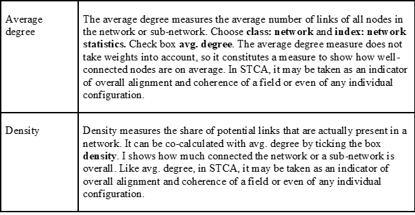
Node-level indicators such as the degree of node level centrality is useful to identify core actors and/or concepts in a field, based on the number and strength of links to a node in the network (see below).To calculate node-level indicators, you select task: indexing, choose the relevant class and index and click analyse. The calculated values will be appended as attributes (indicators) for each node and can thus be used to layout the network or visualize certain attributes (see below). To see what node-level indicators have been calculated, open the attribute manager and click the node button.
Similarly, Visone can calculate network indicators, which in STCA can provide indicators of the overall alignment and coherence of a field. In the panel, click the analysis tab. Choose task: indexing, class: network and index: network statistics. Select the indicators that you want to calculate and apply. To see the results, open the attribute manager (from the toolbar) and click the network button on the top row.
Node level centrality: degree
The degree measures the number of links of a node. Choose class: node centrality and index: degree. Always unclick percentage so you obtain the actual degree value. If link weight is set to uniform you will obtain the simple degree. In STCA the interpretation of the degree varies. In one-mode actor networks for example, it reflects the number of other actors that an actor has shared at least one concept with. In concept networks it reflects the number of other concepts that a concept has been co-used with.
If link weight is set to degree you will obtain the weighted degree. The weighted degree measures the sum of the weights of all the links connected to a node. Its interpretation in STCA depends on the previous methodological choices…
- …to work with the absolute number of co-occurrences of actor and concept nodes when exporting the two-mode networks from Nvivo (include duplicate associations per document), the number of documents in which a co-occurrence has been coded (exclude duplicate associations per document) (see Chapter 4 ‘Exporting data from NVivo’, step 3), or the with a completely unweighted two-mode network (exclude duplicate associations for the whole dataset/window of time) (see Chapter 5).
- … and to normalize or not to normalize the one-mode projections (see Chapter 5).
Depending on these choices, potential interpretations of the weighted degree are:
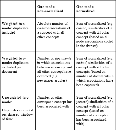
The choices for normalization are either to normalize or not to normalize.
Two examples:
- in a jaccard-normalized concept congruence network (with actors as the associating variable) for which two-mode link weights have been removed, the weighted degree reflects the sum of the jaccard similarity scores of the links between the concept and other concepts. Hence, a concept will have a high weighted degree centrality if actors have used it, who also used a large number of other concepts during a given period. Depending on the nature of the links, this may be interpreted as a concept that is well-aligned with many other concepts – for example, indicating a high degree of institutionalization (see Heiberg et al., 2022).
- in another analysis the researcher may be interested in including duplicates to account for the fact that it may be important that an actor signifies an association to a concept in many newspaper articles or policy documents during the same period. In such a case, we would choose a weighted two-mode export with duplicates excluded per document and normalize the one-mode projection with cosine similarity. The weighted degree then represents the similarity not only based on its compatibility with many other concepts but also based on the number of articles in which actors have used it and all other concepts. This may be useful if the measure of degree of institutionalization should be sensitive to the prevalence of a concept in the overall dataset.
Network-level centrality and density
When calculating network indicators for subsets of a network, i.e. configurations, make sure to make a copy of the original network before singling out the configuration, to avoid that your original network is lost.
Network visualization
This part of the guide is divided into two sections. First, we will demonstrate how to do basic layouting and mapping of a network. Second, we will introduce the basic feature of ‘attributes’ and provide a few examples of how to use attributes assigned to the codes through classifications in NVivo (see Chapter 3) to create custom visualizations.
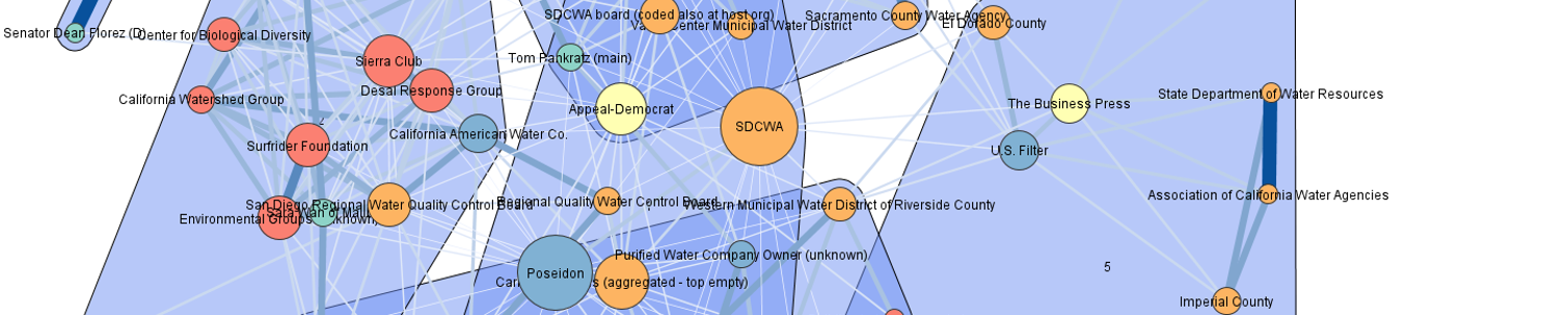
All examples of network visualizations are made on an unweighted one-mode concept-network, which has been calculated based on the Jaccard normalization (see Chapter 4).
Basic network mapping
The standard layout of a network when imported in Visone is a random layout, in which usually relationships cannot be visually interpreted. A good layout to start exploring any network is a simple stress minimization node layout. This is useful in order to visualize the field according to the similarity between concepts and/or actors in a 2D space. In Visone the stress minimization layout rests on a multi-dimensional scaling algorithm that places organization nodes closer to one another, that are connected by a higher link weight (see Brandes and Pich, 2009 for the layout method)
To apply this layout click on visualization in the top-bar on the left-hand panel. The stress minimization node layout is already the default option and you can simply click on layout in the bottom right of the panel. However, depending on previous methodological choices, you may want to adjust the link length scheme under link length. The default here is uniform – which means that nodes are placed according to the multi-dimensional scaling algorithm without taking into account edge weights. If you have chosen to work with a normalized network however, you may want concept nodes to be placed closer to each other that have a high similarity score. To do so, chose link length scheme: attribute value, attribute: csv value, tick the box interpolate min-max, and adjust the length for min/max value such that max is double the value of min. Then click on layout in the bottom right of the panel. This will result in a more distant placement of nodes with a low normalized similarity score/ edge weight and a closer placement of nodes with high similarity.
Network mapping and layout based on attributes
Before starting to explore other visualization options, it makes sense to label the nodes in the network, in order to get a sense of how nodes are positioned.
All visualization options are reachable from the panel under the visualization tab. We will begin with exploring the possibilities under the category: mapping.
Add labels to nodes. One of the most basic mapping features is to add the name of nodes as labels (the names of concepts and/or actors assigned during the coding procedure). These are added simply by selecting type: label, property: node label, attribute: id and clicking visualize.
Change link width. You can change the width of links between nodes based on the normalized similarity value in the one-mode matrix. This will draw thicker links between nodes that are very similar than those between dissimilar nodes. Type: size, property: link width, attribute: csv value.
With this done, you probably already have a decent representation of the fundamental network structure and might observe first basic patterns in terms of clusters of concepts or actors, which may indicate socio-technical configurations, storylines or supportive actor groups. However, in order to improve the visualization, you might want to use complementary variables by deploying the attribute lists exported from NVivo, computed in Excel or manually created (see Chapter 4). In this guide, we will illustrate how this is done by two examples.
First, we want to change the colour of concept-nodes based on an attribute, which we have classified using during the coding procedure. For this example, we have assigned the attribute Sentiment to all concept codes and created a concept classification sheet (an attribute list), and converted it to CSV format (see Chapter 4). The attribute for each concept holds one of two values (1 = positive or 0 = negative) and we want the colours of concept-nodes in our network to correspond to these values, essentially making positive concepts turn out green and negative concepts turn out red. We choose a binary variable as a simple example, but it is possible to use more fine-grained attributes to do the same thing (for example, ‘technology class’ or by assigning any other broad category to nodes). Click on type: color, property: node color. Then add your csv file for Sentiment as attribute. Select method: color table, and chose the desired color for the values (e.g. green for 1 and red for 0). Then click visualize. Always remember to select result in: next tab before clicking on visualize if you may want to return to the previous version of the network!
Second, we want to change the size of concept nodes based on how many times a concept has been used in the data. In other words, we want concept-nodes to appear larger if they are used many times (regardless of the number of actors that use them) and smaller if they are used fewer times. For this, we will have to calculate the sums of the columns in our weighted two-mode csv and save them as an attribute table, e.g. called frequency, with all concept labels in the first column and their column sums in the second column (see Chapter 4). To capture all associations as described above, we should here use the weighted two-mode matrix without the “files coded” option enabled when exporting from NVivo (to get the absolute number of times a concept has been used in the data). In Visone, click on type: size, property: node area and chose your attribute file frequency as attribute. We have found it useful to leave auto scale ticked as the manual adjustment of the size often results in messy layouts. Click on visualize to see the resulting network with adjusted node sizes.
Other layouts: the centrality/ radial layout
A layout that has proved useful for the representation of concept nodes and their degree is the centrality layout. The centrality layouts place nodes along concentric circles according to any chosen attribute value. Click on visualization, category: layout, node layout: centrality, centrality layout: centrality layout. Further chose the options node value: degree, link value: csv value, scope: improve crossings. The resulting network will place nodes with a higher degree centrality closer to the centre of the concentric circles, and nodes with a lower degree more towards the fringes. The most central node is placed at the core, all other nodes follow in some distance to allow for an interpretable picture. In a normalized concept congruence network, this layout helps visually disentangle concepts that are highly compatible with many other concepts from those that are mostly mentioned in isolation. Degree centrality may furthermore be interpreted as the degree of institutionalization of a concept in the analysed field, the layout may help map configurations relative to their incumbency as in the distinction between niche and regime structures in a sector.
Another option is to choose centrality layout: radial layout. Here simply chose degree as a parameter for centrality. The result resembles the centrality layout chosen before. The only difference is that the radial layout applies a constant scale from the centre of the graph moving towards the fringes, whereas the centrality layout leaves an area around core of the graph blank. As a result the most central node is much more pronounced in the centrality as opposed to the radial layout. As a general rule, we would recommend to check and compare both layouts.
References
Baur, M. 2008. Software for the Analysis and Visualization of Social Networks. PhD, Fridericiana University Karlsruhe
Heiberg, J., Truffer, B. & Binz, C. 2022. Assessing transitions through socio-technical configuration analysis – a methodological framework and a case study in the water sector. Research Policy, 51 (1): 104363.
Wasserman, S. & Faust, K. 1994. Social Network Analysis: Methods and Applications, Cambridge, Cambridge University Press.